This post is not concerning Seaborn, but it was inspired by it. I was given this link to a Pokemon themed tutorial and although content covered mostly seaborn I found myself more interested with the data set. The best part about learning new things is that there are so many great discoveries to be made. True, it would have been effective for me to code along with the tutorial, I would have learned a lot about Seaborn. Instead I bookmarked the tutorial and went on my own quest to build the radar charts. Great for comparing stats for the best battlers using this data set of All the Pokemon through generation 6
Let’s Go!
import matplotlib.pyplot as plt
import pandas as pd
from math import pi
%matplotlib inline
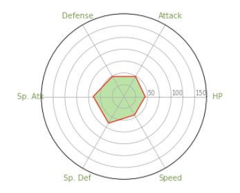
We’ll be using Pokemon #001, Bulbasaur to build out this plot.
categories=list(df_stats)[1:]
N = len(categories)
categories
The categories are the stats of trusty old Bulbasaur and outputs a list of column names from a datafram containing just the stats of the mons and returns this [‘HP’, ‘Attack’, ‘Defense’, ‘Sp. Atk’, ‘Sp. Def’, ‘Speed’]
values = df_stats.iloc[0].drop('Name').values.flatten().tolist()
values += values[:1]
values
#gets your values down to a list that can be mapped to a specific plot

angles = [n / float(N) * 2 * pi for n in range(N)]
angles += angles[:1]
angles
#finds the fraction of the circumference of a circle for each category you have in your chart
The values will be mapped to plot points and must be make a full circle so we add the first element to the end of each list.
Next we build out the subplot. Make it polar!
ax= plt.subplot(111, polar=True)

plt.xticks(angles[:-1], categories, color="#789950", size=10)

ax.set_rlabel_position(0)
plt.yticks([25, 50, 75, 100, 125, 150, 175],[" ", "50", " ", "100", " ", "150"], color="grey", size=8)
plt.ylim(0,175)
ax.plot(angles, values, linewidth=1, linestyle='solid', color="red", label="Bulba")
ax.fill(angles, values, 'b', alpha=.5, color="#78c850")

# To be honest, I'm not sure what 'b' is doing for me in the .fill() method(is it a color?).  Share your knowledge wise readers!
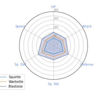
Now that we can plot a single mon and see how beefy their stats look, its like to compare it against other pocket monsters. There are two ways to do that, one is by faceting the charts (which we will get into at a later time) the other is by overlaying more plots onto the same chart. Since I want to know How my favorite starter Pokemon, Squitle, grows in power throughout his stages, it makes sense to layer each of his stages on one plot. From here, it takes just a couple more lines of code.
ax.set_theta_offset(pi/2)
ax.set_theta_direction(1)

#set_theta_offset controls where the first category starts
#set_theta_direction 1 or -1 rotates the categories clockwise or reverse clockwise
And just add a couple water type pokemon:
# Squirtle
values=df_stats.iloc[9].drop('Name').values.flatten().tolist()
values += values[:1]
ax.plot(angles, values, linewidth=1, linestyle='solid', label="Squirtle")
ax.fill(angles, values, 'b', alpha=0.1, color="#9DB7F5")


# Wartortle
values=df_stats.iloc[10].drop('Name').values.flatten().tolist()
values += values[:1]
ax.plot(angles, values, linewidth=1, linestyle='solid', label="Wartortle")
ax.fill(angles, values, 'r', alpha=0.1, color="#6890F0")

# Blastoise
values=df_stats.iloc[11].drop('Name').values.flatten().tolist()
values += values[:1]
ax.plot(angles, values, linewidth=1, linestyle='solid', label="Blastoise", color="#445E9C")
ax.fill(angles, values, 'r', alpha=0.25, color="#445E9C")


plt.legend(loc='upper right', bbox_to_anchor=(0.1, 0.1))
So there, you have it. Radar charts, great for visualizing pokemon stats and directional stats. Many times this kind of chart is useful when cardinal directions are involved with the information, say you want to see where a certain population lies from a specific latitude and longitude. I can’t imagine this kind of chart being useful for ploting linear regresion on although I have seen it used for scatterplots rather than line. In the future I’d like to take sample sets form the Pokemon and facet them against eachother to see help visualize the central tendancies of different types and difference generations. I love how these radar charts and I think they could be useful for presentations to more creative types, could be fun.
Until then, I’ll be looking more closely at the many other ways to visualize data in more scientifically practical methods. Maybe back to Seaborn, I mean, just look at all the stuff you can do.